
I had been working with the very talented and competent Dave Fiske, designing and rendering titles for him that he would shoot at his facility, Animagic, in Burbank. At one point, he was working with Ernie Farino, also a talented director of special effects, who had designed the the criss-crossing animated title to The Terminator for James Cameron, who Ernie knew quite well. A landmark title, by-the-way, and Ernie deserves tremendous credit for designing it and making it work.
Dave was pulling his hair out trying to get all the backlit elements to line up as they were animating against each other in opposite directions so they wouldn't create "matte lines" (areas of unexposed film that come out black on the screen, blotting out the background and looking very annoying...like unacceptable annoying).
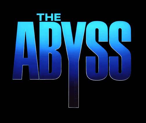
They accomplished the job brilliantly without killing each other, and I think it is one of the most effective titles ever created. Jim thought so, too, and asked Ernie to handle The Abyss for him. Ernie called me (at Dave's suggestion, no doubt) and asked if I could do all the artwork while he directed the shoot. This would be a piece of cake.
I got all the elements together, did the necessary minimal airbrush for the bevels and the surface, took everything over to Ken Smith at Pacific Title and we shot it. Easy-peasey.
Uh-uh. It looked like hell up on the screen because the camera "pushes in" right through the descender on the "Y," and by the time it gets up on a Cinemascope screen, those thin white edges on the descender are three feet across! They looked ragged and awful. What could we do to make those lines sharp at such magnifications? We could only make the art so big.
I tried everything....Rubylith (terrible), etching the emulsion on wet film with a scalpel (terrible)...this wasn't going to work! We couldn't solve this problem! It was complicated by the fact that there was live underwater footage showing through the lettering as we pushed in, with a nuclear submarine appearing out of the gloom as the "Y" disappeared off screen. We couldn't interrupt the shot and put up new, larger artwork for the descender, because you would see the "jump" no matter how clever we were. And Ken Smith is one clever son-of-a-bitch. We were well and truly stuck, until some wag at the camera service suggested we use their new laser etcher.
He etched the film, I stripped it into the artwork, and we were saved!